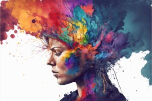
To begin, allow me to explain my train of thought in achieving “Déjà-visité of Brilliance”. This is a unique concept that combines two distinct ideas: Déjà-visité and Brilliance.
First, Déjà-visité is a phenomenon where one has a strong sense of familiarity with a place they’ve never visited before. It’s related to geographical and spatial relationships.
Secondly, Brilliance, in the context of cognitive development, refers to the study of how beliefs about intelligence and achievement develop in both children and adults. In addition, it involves how these beliefs shape people’s choices as they navigate their lives.
Combining these two concepts means creating a home environment that feels familiar and comfortable. But, it also means stimulating intellectual growth and achievement. This involves designing spaces that encourage learning, creativity, and productivity while also providing a sense of comfort and familiarity.
Bonus Tip: upload your images to get your own “color scheme for your home decor and design! Visit ColorHunter today to get in complete control of your color scheme!
I believe that everyone has an innate desire to arrange their surroundings for more comfort. But we also want spaces that uplift our spirits. So, what better time than now!
How to Achieve Déjà-visité of Brilliance
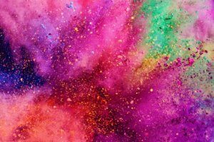
1. Opulent colors to bring instant pizazz
This simple mid-century modern theme is updated with bold yet rich and deeply comfortable colors. It only takes a few pieces in the right tones to bring instant pizazz to an otherwise ordinary scene.
You can go bold or use just a few touches here and there is all it takes. Remember, these are strong and opulent colors, so a little bit goes a long way. It all depends on what makes you feel good!
Uplifting gold for an immediate déjà-visité of brilliance
Gold is nearly synonymous with wealth and abundance. It’s deeply connected to riches due to its inherent worth and rarity. Another impression is that of a success story, or giving awards for achievements. Many also connect it with prestige and influence.
In any case, it’s definitely an positive color. Moreover, its energy is one of success, lifting vibrations and helping those surrounded by this color feel more optimistic. It’s also inherently optimistic, encouraging, and promises positivity.
What’s more, gold is associated with wisdom and knowledge. It inspires you be aware of who you are at your core. It also signifies higher human ideals of enlightenment, cooperation, and connection to the divine. To that end, it’s the color of achievement, accomplishment, and triumph.


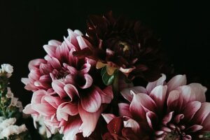
Opulent Violet for depth and sophistication
Dark colors often give an aura of depth and sophistication. They might also create a sense of calmness and are sometimes associated with elegance and formality. The violet hue of this color may evoke feelings of mystery, luxury, and power. Or, it might also bring on feelings of creativity and imagination.
The brown undertones in this color can evoke feelings of warmth, comfort, and security. When people see brown, it might bring on feelings of resilience, dependability, security, and safety. Dark colors like this add a level of sophistication to a design. In fact, they’re often used in branding for a sense of luxury and elegance.
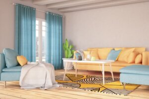
2. Bright blues and whites
Playing up the blues against snowy whites are sure to add a touch of brightness. Blue also looks great with neutral settings as well as more colorful combinations. Additionally, blue is easy to tone up or tone down with the seasons and blends well with a variety of design themes.
Shades of Blues
Blue is widely believed to stimulate creativity. So, be sure to wear blue if you need to brainstorm about something with your co-workers or friends. Also, people who wear navy blue find that public speaking becomes less uncomfortable, and the words flow more smoothly. In the aura, blue indicates serenity, contentment and spiritual development. So, look to the skies and the water for the lovely benefits of the color blue.
Bright blues, like all shades of blue, are often associated with feelings of calmness and relaxation. They are often described as peaceful, tranquil, secure, and orderly. Research finds that the color blue can reduce a person’s heart rate, causing a “sleepy effect” and can also lower body temperature. Blue is also associated with a lack of warmth, emotional distance, and indifference. Despite these negative associations, blue is often chosen as the most popular color in research surveys worldwide.


Happy snowy whites
The term “winter whites” typically refers to the color palette for snowy winter landscapes. While there isn’t specific research on the psychological effects of “winter whites”, we can infer some effects based on related research. White is often known for its purity, cleanliness, and neutrality. In design, white is usually seen as a neutral that lets other colors in a design have a larger voice. However, it’s impact helps invoke feelings of cleanliness, simplicity, and sophistication.
However, the psychological response to color can be highly personal and subjective. Different people may have different reactions to the same color based on their personal experiences and cultural background.


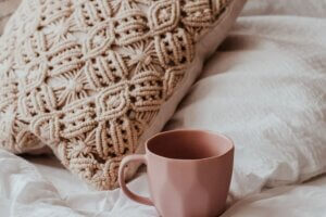
3. Deep blues and browns for toasty yet chic warmth.
If you love toasty yet chic warmth, you’ll love this color scheme. You can go as far as you want with it by using warm throws and wooden furniture. This is great in a rustic setting with your fire burning brightly while glowing on all the natural elements of the room.
Tired of Blah? How to Achieve Déjà-Visité of Brilliance Click To TweetWith all-natural materials in these gorgeous tones, along with handmade wooden and natural fiber artwork and decor, you create an atmosphere of complete winter bliss.
This rather earthy color palette is a favorite of many when decorating because it is timeless, and easily fits into most decors. This palette also represents colors of the earth element that creates a sense of stability and protects relationships.
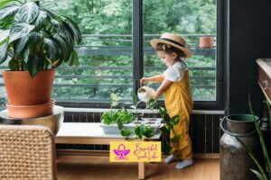
Earthy colors are, therefore, an ideal choice for all zones in the home, and they look especially good in central spaces such as the living room, where they bring calm energy.


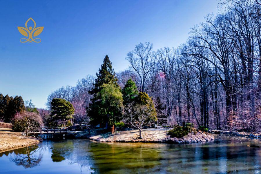
4. Bring a feeling of crisp northern winters inside.
The color scheme you mentioned includes dark to light shades of blue, dark dusty pink, and dark pea green. Each of these colors can have different effects on humans:
Blue helps you feel calm and relaxed. It’s described as peaceful, serene, secure, and orderly. Darker shades of blue help improve problem-solving and decision-making. Lighter shades aid in the ability to focus on the details of a given task. Blue also affects physiological functions. For instance, research shows that the color blue can reduce a person’s heart rate, causing a “sleepy effect” while also lowering body temperature.


Dusty pink is a calming color associated with love, kindness, and femininity. Some shades of pale pink are relaxing, while very bright, and vibrant shades are stimulating. Pink also has a calming effect. However, researchers find that this effect only occurs during the initial exposure to the color.
Pea green represents nature with a calming and soothing effect. Some also believe that it relieves stress and helps heal.
In summary, this color scheme could potentially create an environment that promotes calmness, relaxation, focus, problem-solving abilities, love, kindness, and health.
What will you select to achieve déjà-visité of brilliance?
Go to ColorHunter.com to upload your photo and get your instant color palette. Try uploading as many photos as it takes to find the one you absolutely love! How cool and easy is that?
Use these tips to create the cheerful color schemes that you absolutely adore. This will give you just the déjà-visité of brilliance you need to get through the any season with absolute comfort with your surroundings in your personal environment.
Conclusion
It is our wish that you find this post enlightening and helpful. If you have any questions or suggestions, we love to hear from you in the comments below. Also, kindly accept our invitation to join our group on Facebook to surround yourself with kindred spirits and post your encouraging messages.